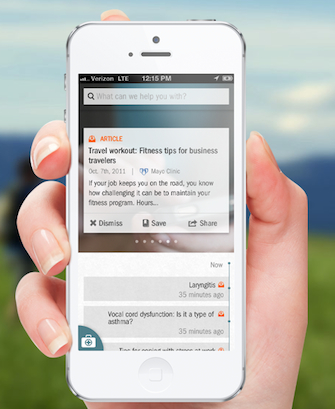
Better's health app
Over the past week, the launch of two startups -- Smart Patients and Better -- with high-profile founders (Roni Zeiger MD and Geoffrey Clapp, respectively) sparked a couple of interesting comments from MobiHealthNews readers. The Smart Patients launch encouraged readers to ask questions about how to manage the information shared in the community, while the Better launch initiated a conversation on the app's usability and value.
Respond to the comments below by clicking to the link directly following each one. As always, to interact with MobiHealthNews staff directly, tweet @MobiHealthNews or like us on Facebook.
Google’s ex-Chief Health Strategist launches startup, Smart Patients
Hunter Hawkins: It's refreshing to see more discussion and movement towards a patient-centric model of healthcare. Question, how is incorrect or non-accurate information filtered out? Link
Roni Zeiger: In communities that are working well, other members of the community challenge questionable information by asking for evidence or pointing out evidence that that they are aware of. We've found that cancer patients and caregivers become very knowledgeable and can work well together -- as a network -- to quickly uncover high quality info as well as point out less good info. Link
davidprior: Isn't this just another Patients Like Me? Link
Roni Zeiger: I think what makes us potentially different from other community platforms:
- Focus on oncology
- Facilitate conversations not just within a cancer group but across groups, e.g., patients with bone mets can learn useful things from each other regardless of the location of their primary tumor
- Built-in clinical trial search that makes it easy to find trials AND have conversations about them; especially in oncology, many of the discussions are about trials, and our initial users asked for this feature Link
Bonnie Feldman: Giving patients in need more information is a powerful tool! Will they be able to connect to other networks, such as the Cancer Knowledge Action Network? Link
Mayo Clinic, Geoff Clapp launch mobile health startup, Better
Maria Dorfner: Gimmick. Anyone wanting to stay healthy or prevent illness is better off spending that $150/month elsewhere. I know a top lifestyle coach in #1 market that charges $10/month. For $150. that lifestyle coach should toss in doing your laundry, housecleaning and picking up your groceries. If they're not, their lifestyle is the one getting better. Better for who is the question. This app serves the hospital. I wouldn't be impressed by the "Black Seal" option. That service has always been available to anyone who pays for it. I'm a fan of the Mayo Clinic, but this app gets a thumbs down. Link
Geoffrey Clapp: Hi Maria, We're still figuring out pricing, and no doubt, we will learn a lot in the market. I'd love to hear more from you about the $10 option, and what they do. While we certainly don't do laundry - and trust me, I can barley handle my own - we do a lot of things outside the "norm" of health care, based on a lot of market research on what people wished they had. I don't pretend it's perfect or fully baked - such is life at a start-up. On the pricing, one comparison I would use is retrofit, which is right in the same area at $149/month - http://www.retrofitme.com/plan... at this is for weight loss only. There is no doubt we have a lot to figure out and certainly have a lot to learn by listening to the market and people like you - so to that end, I would like to hear more, please do reach out... Thank you. Link (with contact info, too)
Matt M: I work for a company called cloud2health doing something similar for a year now. The mobile app is releasing next month after user experience testing for the last 3 months. We're running freemium, free for most users, $9.99 a month for those that want higher features/no-ads. Also, from the presentation I saw, I think much of this is too dense for a mobile experience. This is something we learned quickly, a mobile experience doesn't lend itself to dense content overload. You have to walk to the line between app and medical device, too many people are stuck on the medical device model and end up making devices with terrible mobile UI. Mobile apps should be "medical light" for the average user, let power users access via tablet and web. The mass of people will fall in the medical light user model, only 15 percent or so of the population wants the information overload, the rest just want the one line summary. Link
Geoffrey Clapp: Hi Matt, I'd whole-heartedly agree on market feedback and mobile experiences. I get the sense you've learned a lot in your user trials, which is is great for our market. There is so much to learn from user trials and feedback loops, and there's a real need for very quick, consumable, mobile content. Obviously, a big part of that model is to get from content to care (through a credentialed professional, where needed) as quick as possible when it's needed - even in our free versions, this is a big goal of ours. I don't agree that Medical Devices are a good example of overload/dense. FWIW, I'd actually argue (After far too long in this space) that most medical devices provide no useful, actionable, content to their users, and that's a big problem. That said, you're points on dense + mobility are spot on and important. Our entire market throws numbers and graphs at people and expects change, and that's not okay. That said, very best to you and cloud2health. I'm glad you are focused on user feedback, it's so critical. Link


